Pressure Enthalpy Without Tears: Reading the P-h Chart for F-Gas Exams
Demystify the pressure-enthalpy chart with five simple measurements and learn how the plot shifts reveal charge and airflow faults on any F-Gas system.
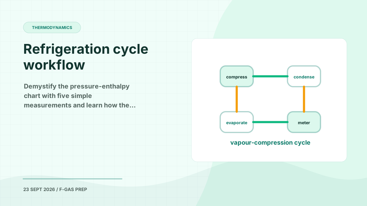
Ask a room of refrigeration technicians what puts them off thermodynamics and the pressure-enthalpy chart comes up every time. It is a dense sheet of curves, sloping lines and tiny numbers, and the instinct when it lands in front of you is to look away. That reaction is completely normal — and completely fixable.
Eugene Silberstein, who has spent over 40 years in the industry and now directs technical education at the ESCO Institute, built an entire course around exactly this problem. His framing is worth borrowing before you read another word of theory:
If we change the way we look at things, the things we look at change.
The chart has not become simpler. What changes is how you approach it. Below, we break the p-h diagram down the way he does — one family of lines at a time — and then connect it to what City & Guilds 2079 actually asks you to understand about the refrigeration cycle.
Why Bother Plotting a System at All?
On site you gather information in pieces. You walk to the air handler for one reading, out to the condensing unit for another, back inside for the supply air temperature. Every measurement is a fragment.
A completed p-h plot pulls all of those fragments into one picture of the entire system. From that single diagram you can:
- Estimate the refrigerating effect and the system capacity
- Estimate efficiency (COP, and from it EER and SEER)
- Work out the mass flow rate of refrigerant per kW of cooling
- Determine the volumetric capacity of the compressor
- Identify the state and quality of the refrigerant at any point in the circuit
- Diagnose charge and airflow faults from the shape of the plot
There is a practical reason this matters for certification work as well. The smart tools and diagnostic apps technicians now carry are built on p-h chart mathematics. Understanding the chart is understanding what those tools are doing when they tell you a system is underperforming.
Breaking the Chart Into Its Parts
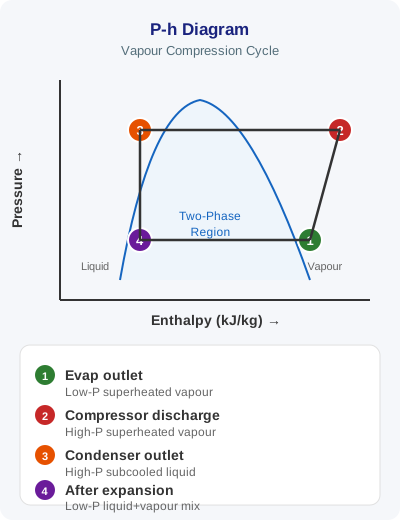
Taken as a whole, the chart is intimidating. Taken one line family at a time, there is nothing to it.
Lines of constant pressure run horizontally. Pressure sits on the vertical axis. Move left or right and the pressure is unchanged; move up and pressure increases, down and it decreases. One caution: the vertical axis is absolute pressure, not gauge pressure. Add roughly 1 bar (14.7 psi) to your gauge reading to get close to the absolute value.
Lines of constant enthalpy run vertically. Enthalpy — heat content — sits on the horizontal axis. Move up or down a vertical line and the heat content is unchanged. Move right and enthalpy increases; move left and it decreases.
Enthalpy is a fancy word for heat.
That is the whole definition. Temperature tells you the intensity of heat; enthalpy tells you the quantity, in kJ per kilogram.
The saturation curve sits in the middle — sometimes called the thumbprint curve. It divides the chart into three regions:
| Region | Position | What is happening |
|---|---|---|
| Subcooled liquid | Left of the curve | 100% liquid, below its saturation temperature — condenser outlet |
| Saturated mixture | Under the curve | Liquid and vapour coexisting — evaporator and condenser phase change |
| Superheated vapour | Right of the curve | 100% vapour, above its saturation temperature — evaporator outlet, suction line, compressor |
Lines of constant quality sit beneath the saturation curve, each representing a 10% step in the liquid/vapour split. The left boundary is 100% liquid, the right boundary is 100% vapour. Drop a point anywhere under that curve and you can read off the composition — 80% liquid and 20% vapour, say, at the evaporator inlet.
Lines of constant temperature run horizontally beneath the saturation curve for a single-compound refrigerant such as R134a, where one pressure corresponds to exactly one temperature. For a zeotropic blend — the 400-series refrigerants — those lines slope. That slope is temperature glide, and you can measure it directly: draw a horizontal line across the saturation curve, read the temperature where it meets each side, and subtract. Once you move right of the curve, the constant-temperature lines bend sharply downward.
Lines of constant specific volume slope gently across the superheated region, telling you the volume occupied by one kilogram of refrigerant under those conditions. Since a compressor is a fixed-volume pump, knowing the specific volume at the compressor inlet lets you convert swept volume into actual refrigerant mass flow — a critical step in capacity calculations.
Lines of constant entropy are the steep ones, and they trip everyone up. Forget the dictionary definitions about disorder and decay. Silberstein teaches entropy with one word: reversibility. Compress refrigerant in a cylinder and the pressure rises; let the piston back and the pressure returns to where it started. Compression is reversible, so ideal compression follows a line of constant entropy. Melt an ice cube and then turn the heat back down — the water does not become ice again. That process crosses entropy lines.
The Four Processes, Traced Round the Circuit
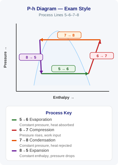
Now walk the cycle:
- Compression — the line moves up and to the right, following (or running parallel to) a line of constant entropy. Pressure rises and enthalpy rises, because the compressor adds both the heat of compression and motor heat to the refrigerant.
- Condensation — the line runs right to left along the top. Note that it starts in the superheated region: the discharge line and the first portion of the condenser are desuperheating, not condensing. The refrigerant then crosses the saturation curve and condenses, and finally extends past the left boundary into the subcooled region — that small triangle at the top-left corner is your subcooling.
- Expansion — a perfectly vertical line downward through the metering device. Pressure and temperature fall dramatically; enthalpy does not change at all. No heat is added or removed, so the line cannot move sideways.
- Evaporation — the line runs left to right along the bottom. It begins under the saturation curve, typically around 80% liquid and 20% vapour, and ends outside the curve in the superheated vapour region. Between the evaporator outlet and the compressor inlet sits the short suction line segment — and the shorter that segment, the better.
That last point has a direct field consequence. Strip the insulation off a suction line, replot the system, and the suction line segment stretches out while the whole compression line shifts right. You are watching superheat pick-up degrade efficiency in real time.
Efficiency, Explained Without the Maths
Efficiency is a ratio of what you get out to what it costs you to get it. In refrigeration:
- What you get out is the net refrigerating effect (NRE) — the heat absorbed in the evaporator.
- What it costs is the heat of compression (HOC) — the energy added by the compressor, plus the unwanted heat picked up in the suction line.
Coefficient of Performance = NRE ÷ HOC. That is the only equation you need here, and everything else falls out of it:
- EER = COP × 3.412 (the conversion between BTU/h and watts)
- SEER ≈ EER × 1.2
- EER2 ≈ 0.95 × EER, and SEER2 ≈ 0.95 × SEER
Plot five points, read five enthalpy values, and you can work out the performance of the system in front of you.
Reading Faults From the Shape
This is where the chart earns its keep diagnostically. Plot a healthy system, then plot a faulty one, and the direction of shift identifies the fault family:
| Fault | How the plot moves | Tell-tale signs |
|---|---|---|
| Overcharge | Up and to the left | Subcooling triangle grows; compressor inlet moves toward the curve (superheat falls) |
| Undercharge | Down and to the right | Subcooling triangle shrinks; superheat rises |
| Overfeeding metering device | Plot becomes shorter | Less refrigerant high side, more low side |
| Underfeeding / restricted liquid line | Plot becomes taller | Excess high side, deficiency low side |
| Low side (evaporator) airflow fault | Down and to the left | Suction pressure and saturation temperature fall |
| High side (condenser) airflow fault | Up and to the right | Head pressure and condensing temperature rise |
Airflow problems move from the bottom left to the top right, whereas charge problems move from the top left to the bottom right.
Two diagonals, two fault families. That single observation turns the chart from an academic exercise into a diagnostic tool.
It also explains something every technician knows but few can articulate. Why does a dirty filter hurt performance? Less heat is added to the refrigerant, so suction pressure drops, saturation temperature drops, net refrigerating effect drops, heat of compression increases, and COP falls. Knowing that — not just “it doesn’t work good” — is the difference between a technician and a diagnostician.
Where This Sits in the F-Gas Syllabus
Under EU F-Gas Regulation 517/2014 Article 10 and Implementing Regulation 2015/2067, Category I personnel must demonstrate both theoretical and practical competence across the full refrigeration circuit. The p-h chart underpins several 2079 skill groups directly:
- Basic thermodynamics — saturation, superheat, subcooling, latent and sensible heat, the pressure-temperature relationship, and temperature glide in zeotropic blends
- Refrigeration system components and operation — the role of compressor, condenser, metering device and evaporator, and how each maps to a segment of the plot
- Environmental impact and energy efficiency — Article 1 of the Regulation frames F-Gas containment as emissions reduction, and a system running with poor COP burns more electricity for the same cooling output
- Leak checking under Articles 3 and 4 — an undercharged system reads directly off the chart as a plot shifted down and to the right, with elevated superheat and collapsed subcooling
Exam questions rarely ask you to plot a full cycle under timed conditions. They do ask which process is isenthalpic, where in the condenser desuperheating occurs, what temperature glide means for a blend, and what happens to superheat when a system is overcharged. Every one of those answers is visible on the chart.
How F-Gas Exam Prep Fits Into This
Thermodynamics questions are among the most heavily weighted on the City & Guilds 2079 paper, and they are exactly the ones candidates tend to leave until last.
The F-Gas Certification Exam Prep app puts 370+ exam questions across all skill groups in your pocket, including a dedicated thermodynamics and refrigeration cycle bank covering saturation, superheat, subcooling, latent heat, temperature glide and system efficiency. Every answer comes with a detailed explanation that tells you why the correct option is correct — because an answer you cannot explain is an answer you will forget before assessment day.
When you are ready to test yourself properly, the mock exams mirror the real City & Guilds 2079 format, including the question distribution and time pressure of the actual paper. For revision on the move, the AI voice challenges let you work through questions hands-free — ideal for the drive between jobs, when a chart on a page is not an option but a spoken question still works.
Take Silberstein’s advice and get hold of a p-h chart for a refrigerant you work with regularly. Plot a system you know is healthy. Then plot one you have just repaired. Once you have seen the shape change with your own readings, the theory stops being theory.
Start Practising Today
Download the F-Gas Exam Prep app and study with 460+ practice questions, mock exams, and detailed explanations.