Reading the Pressure-Enthalpy Chart: A Practical Guide for F-Gas Candidates
A step-by-step guide to constructing and reading the p-h chart, covering saturation curves, quality lines and superheat regions for City & Guilds 2079.
Ask a room of refrigeration engineers what the pressure-enthalpy chart is for and you will get two answers. Half will say it is a design tool for people who sit at desks. The other half will admit, quietly, that once it clicked, they started diagnosing systems faster. The second group is right. The p-h chart is the single clearest picture of what your refrigerant is doing between the compressor discharge and the evaporator outlet, and every superheat reading you take on a job is a point on that chart whether you draw it or not.
This guide walks through how the chart is built up, region by region, following the approach used in a well-known thermodynamics teaching module. Build it once yourself and you will never have to memorise it again.
Setting Up the Axes
Start with two axes. The vertical axis is pressure, and this is where most newcomers trip up:
“Note that the scale is going to be log scale. So we have 0.1, 1, 10 and 100, and the units for pressure are bars.”
That logarithmic spacing is deliberate. A low-temperature pack might evaporate at 0.6 bar absolute while the discharge sits above 25 bar. On a linear scale the entire low side would be a smear near the origin. Log spacing gives you usable resolution at both ends of the system.
The horizontal axis is specific enthalpy in kJ per kilogram of refrigerant, and this one is a plain linear scale — 0, 100, 200, 300 and upwards. Enthalpy is simply the heat energy content per kilogram. The horizontal distance between two points on the chart is the heat transferred in that process, which is why the chart makes capacity calculations so direct.
One point worth carrying into the exam: pressures on a p-h chart are absolute, not gauge. Your manifold reads gauge pressure. Add roughly 1 bar to convert to absolute before you go looking for a point on the chart.
The Bell-Shaped Curve and What Lives Either Side
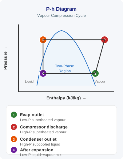
Next comes the shape everyone recognises: a bell curve skewed to the right, sitting over the middle of the chart.
The left-hand branch is the saturated liquid line. Any point sitting on it is refrigerant that is entirely liquid but on the verge of boiling. To the left of that line is the subcooled liquid region — liquid held below its saturation temperature for the pressure it is at. That is the condition you want in your liquid line, because subcooled liquid will not flash off on its way to the expansion device.
The right-hand branch is the saturated vapour line. A point on it is 100% vapour with no superheat at all. To the right of it lies the superheated vapour region, where the gas has been heated above its saturation temperature. That is where your suction line and your discharge line both sit.
The two branches meet at the top at the critical point. Above that pressure and temperature there is no meaningful distinction between liquid and vapour, and no amount of pressure will condense the refrigerant. It is why transcritical CO2 systems behave so differently from conventional HFC plant — they operate above the critical point on the high side, so there is no condensation, only gas cooling.
Inside the bell is the two-phase region: liquid and vapour coexisting. Almost everything useful in refrigeration happens inside that dome.
Temperature Lines: Three Regions, Three Behaviours
Temperature behaves differently in each of the three regions, and understanding why is worth more marks than memorising the picture.
Inside the dome, temperature lines run horizontally. Pressure and temperature are locked together during a phase change — this is the pressure-temperature relationship you use every day when you convert a gauge reading to a saturation temperature. The video marks temperatures along both saturation curves at matching horizontal levels:
“For the saturated liquid curve we will label -50, -40, 20, 30 and 90… and keeping the same horizontal level on the right hand side we will write -50, -40, 20, 30 and 90.”
Same pressure, same temperature, whether you are at 5% quality or 95%. All the heat going in is doing the work of boiling, not raising temperature.
In the superheated region, the constant-temperature lines drop away from the saturated vapour curve and curve down and to the right. Once every last droplet has boiled, adding more heat raises the temperature — that is sensible heat, and it is exactly what your superheat measurement is quantifying.
In the subcooled region, constant-temperature lines are effectively vertical. As the video points out, most published charts leave these off:
“On the left hand side we don’t actually see these curves on the pH chart, but we will draw these vertical lines from these various temperature values… it is understood that vertical lines originating from those temperatures represent constant temperature lines in that region.”
The practical reading of that: enthalpy of subcooled liquid depends almost entirely on temperature and barely at all on pressure.
Constant Entropy Lines
Springing from the saturated vapour curve and leaning to the right are the constant entropy lines. These matter for one process in particular — compression.
Ideal compression is isentropic, meaning it follows one of these lines. So on the chart, the compression stroke runs up and to the right along a constant entropy line, from the suction condition to the discharge pressure. Real compressors are not isentropic — friction, heat transfer and valve losses push the actual discharge point further right, which is why real discharge temperatures run higher than the theoretical value. The gap between the two is the isentropic efficiency of the machine, and it is why a worn compressor with leaking valves discharges hotter than a healthy one at the same conditions.
Quality Lines: Reading the Two-Phase Region
Inside the dome, a series of lines fan out from the critical point down to the base. These are the quality lines, sometimes labelled at 10%, 20% and so on through to 90%.
“Quality is also sometimes called dryness fraction. You will see that name also given to quality in some of the problems.”
Both names describe the same thing — the vapour fraction by mass:
- 0% quality = the saturated liquid line. No vapour present at all.
- 100% quality = the saturated vapour line. Entirely vapour, no liquid remaining.
- Anything between = a wet mixture. At 25% quality, a quarter of the mass is vapour and three quarters is still liquid.
This is where the chart earns its keep in fault-finding. When liquid refrigerant leaves the condenser and passes through the expansion valve, the pressure drop causes some of it to flash instantly into vapour. That flash gas does no useful cooling — it has already absorbed its latent heat. The point where the refrigerant lands on the chart after expansion tells you exactly how much flash gas you have. Subcool the liquid more and that point shifts left, landing at a lower quality, meaning more liquid available to boil in the evaporator and more capacity for the same mass flow. That is the entire argument for maintaining good subcooling, drawn in one line.
Similarly, the evaporator process runs left to right along a horizontal line inside the dome, from perhaps 20% quality at the inlet to 100% at the saturated vapour line, then out into the superheated region by however many kelvin of superheat the expansion valve is holding.
Where This Sits in City & Guilds 2079
The p-h chart underpins several skill groups in the 2079 assessment, particularly those covering the basic refrigeration cycle, the physical properties of refrigerants, and system efficiency. Candidates in Category I — full handling rights on all system sizes — face the broadest range of questions on cycle theory, but every category needs the fundamentals.
Expect the theory to surface through applied questions rather than as chart-drawing exercises:
- Latent versus sensible heat — recognising that horizontal movement inside the dome is latent, while movement in the superheat and subcooled regions is sensible.
- Superheat and subcooling — knowing which region each is measured in and why both matter for compressor protection and system capacity.
- The effect of raised condensing pressure — a blocked condenser raises the high side, which lengthens the compression stroke, raises discharge temperature and reduces the useful refrigerating effect.
- Refrigerant properties — the reason R744, R290 and R134a charts look so different in shape and scale.
There is a regulatory dimension too. Efficient operation is not just good practice — Regulation (EU) No 517/2014, retained in Great Britain as the GB F-Gas Regulation, requires operators to prevent emissions and to maintain equipment properly. A system running with poor subcooling, high superheat or an overcharge is working harder, running hotter and stressing joints and seals — all of which raise leak risk. Article 3 places a general obligation to prevent leakage and to repair detected leaks without undue delay, while Article 4 sets the leak-checking intervals based on CO2 equivalent charge. Understanding the p-h chart helps you spot the inefficiency before it becomes an emission.
It also connects to charge minimisation. Since Annex III restrictions and the phase-down schedule have pushed the industry towards lower-GWP refrigerants and smaller charges, getting the cycle right on paper matters more than ever — there is less refrigerant margin to hide sloppy commissioning behind.
Turning the Chart Into a Habit
You do not need to carry a p-h chart in your toolbox. What you need is the mental picture, so that when you take a set of readings you can place them:
- Suction pressure and suction line temperature → a point out in the superheated region, right of the saturated vapour line. The horizontal gap from the curve is your superheat.
- Discharge pressure and discharge temperature → a point far right and high, deep into superheat.
- Liquid line pressure and temperature → a point left of the saturated liquid line if you have subcooling; sitting on the curve if you have none.
Three readings, three points, and you have effectively sketched the working cycle. A technician who thinks this way spots a restricted expansion valve or a flooded evaporator faster than one who only compares numbers to a table.
How F-Gas Exam Prep Fits Into This
Thermodynamics is one of those topics where reading about it is not the same as being tested on it. The F-Gas Exam Prep app gives you the practice that turns understanding into recall:
- 370+ exam questions spanning every skill group, including a dedicated body of thermodynamics and refrigeration cycle questions covering saturation, superheat, subcooling, latent heat and quality.
- Mock exams that mirror the real City & Guilds 2079 format, so the timing and question style are familiar before you sit the assessment.
- AI voice challenges for revision away from the screen — useful for drilling the pressure-temperature relationship or the difference between the three regions of the chart while you are driving between jobs.
- Detailed explanations for every answer, so a wrong response teaches you the underlying principle rather than just marking you down.
Work through the thermodynamics questions with the chart in mind, and the theory stops being abstract. It becomes the same picture you carry to every callout.
Start Practising Today
Download the F-Gas Exam Prep app and study with 460+ practice questions, mock exams, and detailed explanations.